Billboard advertising, a cornerstone of out-of-home (OOH), seamlessly integrates into our daily environments, naturally capturing attention. It is tested, trusted and transforming the game. But here's the thing – the best billboard advertising is not only seen, it’s felt. To be truly unforgettable, every creative should be tailored to a brand’s unique goals, whether that’s driving foot traffic, building brand awareness, or sparking a conversation.
Need some inspiration? Here are 10 of the best billboard advertising examples we could find. From thought-provoking campaigns that elicit emotions to striking branding and design, these examples turn heads and leave a lasting impression.
1) Swehl: Making mothers proud

Would you believe that this empowering depiction of motherhood was taken down from one of Times Square's most iconic screens? Swhel, a breastfeeding start-up, launched a digital billboard ad featuring influencer Molly Baz and the beauty of motherhood. The billboard was originally removed and replaced with a more conservative image of Baz, a decision that was quickly reversed after public outcry.
Why it works:
- Becoming influencers: Partnering with influencers creates a direct connection between a brand and an audience. If Molly believes in the product, her audience will follow. By sharing her voice, Swehl is tapping into nearly a million followers before the billboard is even launched.
- Taking up space: Just like an apartment, a billboard is real estate, and for the best billboard ads, it's all about location. Swehl tapped into one of the densest areas of consumers, maximizing exposure and brand recognition under the lights of Times Square.
- Read between the lines: This ad is more than marketing, and that’s why it works. By emphasizing the power of women in raising the future, Swehl becomes a part of the purpose, leaving their ad (and brand) in the minds of moms everywhere.
2) Porsche: Accelerate your journey on the road to luxury

Porsche's “Sparks will fly” billboard, strategically placed along a busy highway, utilizes OOH advertising to convey luxury, performance and exclusivity. This advertisement not only captures attention but also reinforces Porsche's brand image, enticing potential customers to consider visiting their dealerships and investing in their vehicles.
Why it works:
- Don't just display, engage: The billboard invites viewers to envision themselves behind the wheel of the Cayenne E-Hybrid, blending innovative, sustainable luxury with high performance. Enticing visuals and messaging spark a desire to experience the vehicle firsthand.
- Spark some inspiration: The best billboard designs reflect a brand’s identity. Porsche’s sleek and sophisticated personality lets the brand shine through, while the motion suggests speed and power, another core element of their product.
- Location, location, location: Positioned in a high-traffic area, this large-format billboard maximizes visibility and impact. It targets affluent commuters, car enthusiasts and professionals—those most likely to consider a luxury vehicle.
3) Fruju: Forecasting flavors to beat the heat

Fruju’s billboard is a refreshing splash of creativity, showcasing weather data and large-format design that can “chill” with the best of them. This vibrant display engages audiences with ice-cold messages and a seamless branding experience. Fruju crafts a crisp brand message that’s impossible to ignore.
Why it works:
-
Maximizing impact: Placed in a bustling urban area, Fruju’s large-format billboard ensures high visibility to both pedestrians and drivers. This prime location guarantees wide exposure, making it an effective tool for boosting brand awareness and driving engagement.
- Creative and dynamic: With the clever tagline “It’s 23°C, time to cool down,” Fruju serves up real-time temperature data with dynamic creative, forming a hyper-local connection with the audience.
- Color that commands: This clever use of color not only enhances visibility from afar but also evokes emotions, making it impossible to ignore. With the right palette, a billboard can transform into a memorable masterpiece, leaving an indelible mark on the minds of its audience.
4) Jägermeister: Oh deer! Let’s raise a glass.

Jägermeister’s billboard advertising is a shot above the rest, expertly mixing large formats, precise targeting and eye-catching design to craft a compelling brand message. This campaign doesn’t just grab eyes; it "raises the bar" for brand identity and stirs up some serious consumer engagement. Cheers to a campaign that truly "hits the spot"!
Why it works:
- Unmistakably Jägermeister: With bold visuals, a witty tagline and strategic placement, Jägermeister’s billboard conveys a unified branding message. The billboard's eye-catching design is not only visually striking but any avid hunter is guaranteed to relate to it and remember its message.
- The power of a slogan: The bold tagline, “Beer is better with a deer,” is clever and memorable. This approach fosters a deeper emotional connection with consumers, making the brand a part of their hobbies.
- It's all about context: Targeting young adults and beer enthusiasts, Jägermeister’s billboards are placed near nightlife spots, entertainment districts and major highways. Putting thought behind the ad’s location ensures it reaches a relevant audience, maximizing exposure and engagement.
5) Burger King: Offering the audience a flame-grilled fortune

Burger King is on a mission to make sure everyone can savor their Whopper, their way. Combining precise location targeting, an enticing promotional offer and effective design, this billboard delivers a compelling message that resonates with the audience. Burger King invites you to join the Whopper revolution, where your tastebuds make the rules and every visit could be a winning one.
Why it works:
- Visual feast: The vibrant images of fresh burger ingredients catch the eye, enticing the audience to visit. This engaging digital billboard attracts attention, builds loyalty and encourages repeat visits.
- Get local: People love to feel seen. Localizing your ad to its specific location feels personal and relevant. In turn, those passing by are more likely to engage with and remember its message.
- Sweetening the deal: By offering a chance to win $1 million, Burger King taps into their audience’s excitement and curiosity. The call-to-action directs viewers to a specific website, encouraging them to participate in the promotion.
6) Dior: A different kind of runway

Dior’s billboards transform the streets into a runway, showcasing a gallery of sophisticated styles and intricate details. This remarkable billboard ad is a testament to the brand's dedication to grabbing audience attention. When it comes to luxury, consumers want to see their aspirations in a brand. Dior successfully captures that essence and entices viewers to immerse themselves in the world of high fashion. That’s what makes it one of the best billboard designs for the luxury market.
Why it works:
- Dior on display: Beyond brand visibility, the campaign invites viewers to engage more deeply with Dior. Captivating visuals drive traffic to stores and the website, creating a seamless path from ad to purchase and offering a taste of elegance and quality.
- Make an impact: Positioned on a high-traffic roadway, these billboards ensure Dior's message reaches a broad audience, from daily commuters to occasional travelers. The prime location amplifies reach and aligns with Dior's luxurious image, targeting those who appreciate the finer things in life.
- Life is a runway: Meticulously crafted designs showcase the essence of luxury, with high-definition photography and vibrant colors highlighting the intricate details and sophisticated styles of Dior's clothing.
7) Hillshire Farms: Redefining the rainy day routine

When it comes to the best billboard advertising, it’s all about being relevant. Hillshire Farms did just that, turning gloomy days into delicious opportunities. Positioned against a dramatic, stormy sky, the billboard captures immediate attention, leveraging the power of weather-based marketing to deliver a message at the time it matters most.
Why it works:
- Weather-triggered magic: By syncing ads with the weather, Hillshire Farms’ message hits right when it’s most relevant. The billboard engages consumers with spot-on content, resonating with audiences when the moment’s right.
- Visual feast: The textured red background with a clear message pops against dark clouds, while a mouthwatering sandwich tempts the audience with deliciousness.
- Driving consumer engagement: By matching their message to the weather, they capture attention and offer a delicious solution to a gloomy day, making every purchase a win-win between Hillshire Farms and their customers.
8) Pepsi: Serving it ice-cold in your neighborhood

When introducing the newest Pepsi product, this campaign had customers fizzing with excitement! Strategically popping up near Walmart stores, these billboards turn heads and spark curiosity. Through this campaign, Pepsi transforms everyday shopping trips into a refreshing one.
Why it works:
- Keeping it interesting: The bold, sleek Pepsi Nitro billboard showcases a can and frothy glass, emphasizing its smooth, creamy qualities. Clear text and the Walmart logo with "Available first at Walmart" give key purchasing details and highlight brand partnerships.
- Launching something new: Introducing a creative new product is like throwing a splash of color onto a blank canvas. When a product stands out for its innovation, it not only disrupts the market but also ignites a sense of excitement among consumers.
- Staying close to the goal: Positioned on high-traffic roadways near Walmart stores, these billboards ensure that consumers see the ad close to a purchase point. This strategic placement maximizes relevance and convenience, driving foot traffic directly to Walmart to try Nitro Pepsi.
9) Hoka: Going the extra mile

Hoka's billboard advertising was a "run"-away success! By sprinting ahead with the unique strengths of out-of-home, Hoka captures the attention of its target audience, inspiring them to step up their game. This billboard not only catches the eye but also reinforces Hoka's stride as a leader in the athletic world. With Hoka, every step is a race toward greatness.
Why it works:
- Running the show: Hoka’s digital billboard ad captures the attention of pedestrians and drivers alike. It stands out in the bustling urban environment, ensuring continuous engagement and high visibility.
- Sparking inspiration: Bold, vibrant visuals feature a runner mid-stride, perfectly representing the tagline, “Fly Human Fly.” This imagery, combined with Hoka’s signature colors and typography, creates a powerful and motivating message that resonates with viewers, reinforcing brand recognition and consistency.
- Connecting with the right audience: Hoka’s billboard reaches a diverse and active audience. By targeting areas frequented by fitness enthusiasts, commuters and urban professionals, Hoka connects with those likely to be interested in their high-performance footwear, enhancing relevance and engagement.
10) McDonald’s: Tempting your taste buds

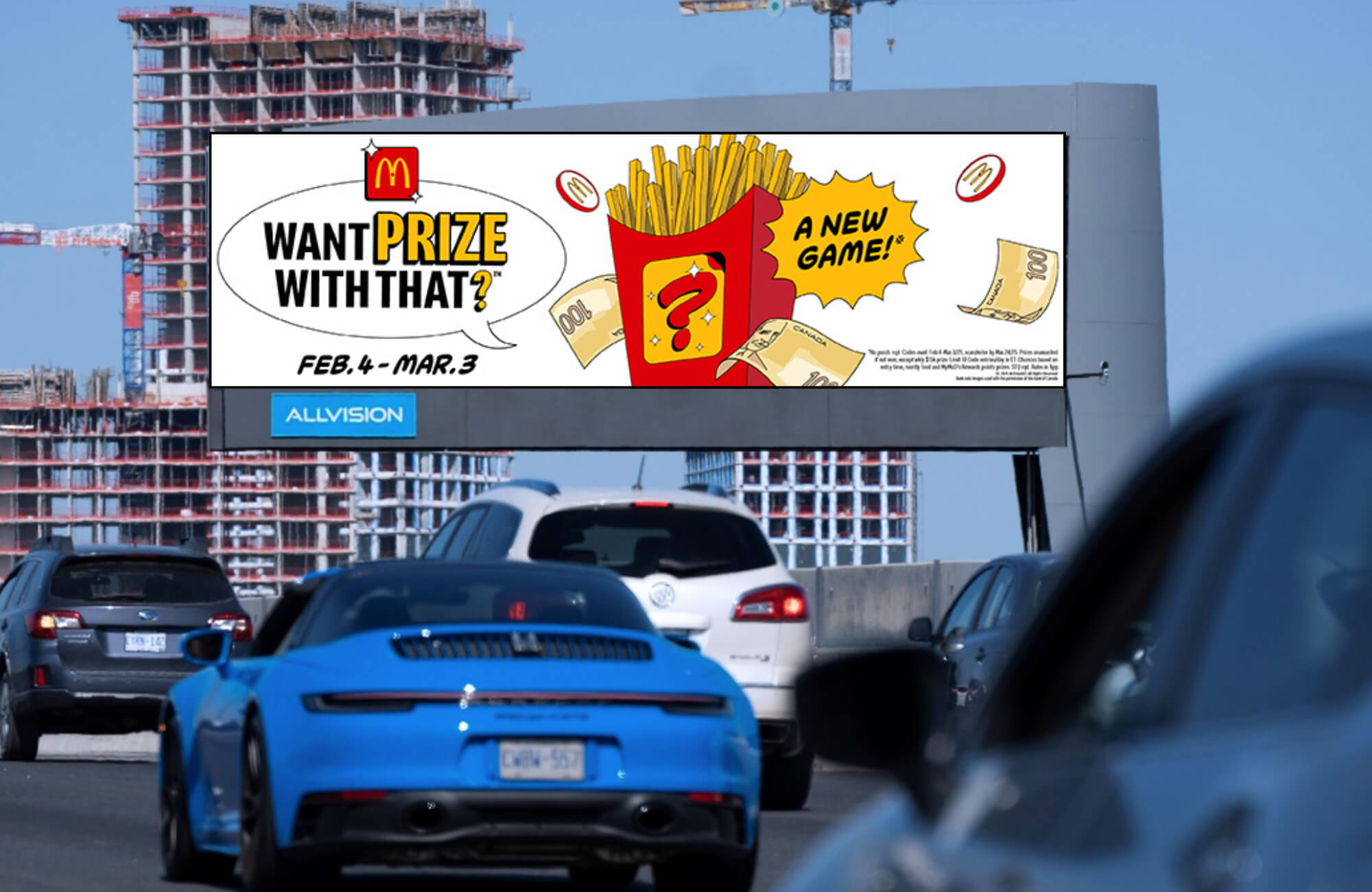
McDonald's “Every day just got tastier” billboard campaign is a golden opportunity that’s too good to pass up! With an impactful design that practically sizzles, McDonald's effectively communicates their mouthwatering value menu that tempts taste buds and wallets. With this campaign, McDonald’s goal is to “ketchup” with audiences and drive them straight to the drive-thru–because every day is a good day for a tasty treat!
Why it works:
- Location is everything: More exposure means more foot traffic. When people see your brand, they remember it and stop by, turning walkers into happy customers. It's about making connections in busy areas that lead to tasty detours!
- Know your audience: Placed in a bustling area frequented by busy commuters, families and individuals on the go, this advertisement speaks directly to potential customers who are on the hunt for a quick and satisfying meal option.
- Feast for the eyes: With a large, bold format, the offer grabs your attention faster than a kid spotting a Happy Meal toy! The drool-worthy images of mouth-watering food create an instant craving that’ll have you saying, “I’m lovin’ it!”
Want to activate the best billboard advertising for your brand?
Imagine your brand's message coming to life on a massive screen, grabbing the attention of consumers and engaging them in ways no other channel can. Whether it's on bustling city streets, shopping centers or down highways, the best billboard ads grab attention and make a statement.
Want to see more out-of-home advertising examples? Explore our case studies!
If you’re interested in launching a campaign, Vistar Media is ready to support you and your goals. Contact our team today to learn more about the services we provide.


